TEXADA SHORES
SERVICES:
BRAND IDENTITY
stationary design
OBJECTIVE:
branding aimed to capture the coastal essence and stand out among competitors. A logo featuring the estate atop ocean waves, a coastal-inspired color palette, and versatile assets were designed to evoke a sense of home. The solution met the client’s needs for attention-grabbing visuals across platforms, enhancing their brand presence and trust with visitors.
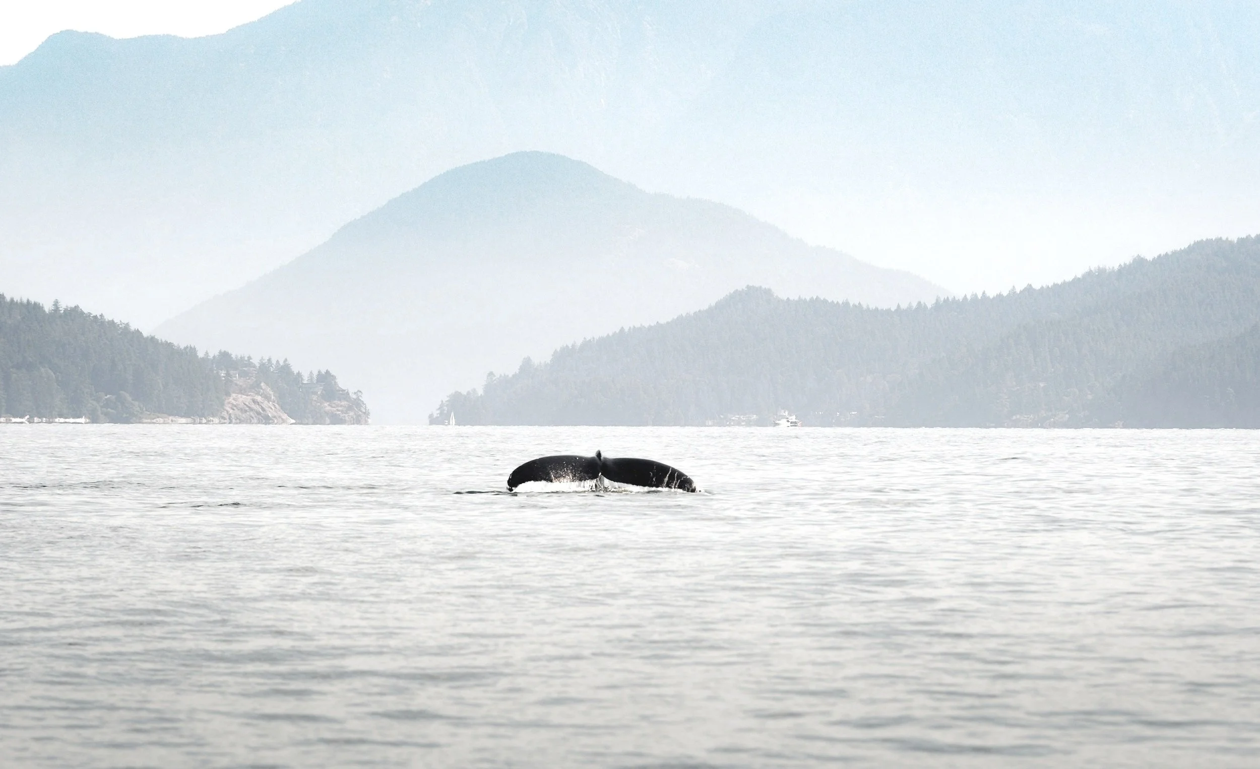
overview:
a vacation rental on Texada Island, the estate is situated on the west coast of british columbia offering a tranquil escape from day-to-day life.
LOGO DESIGN
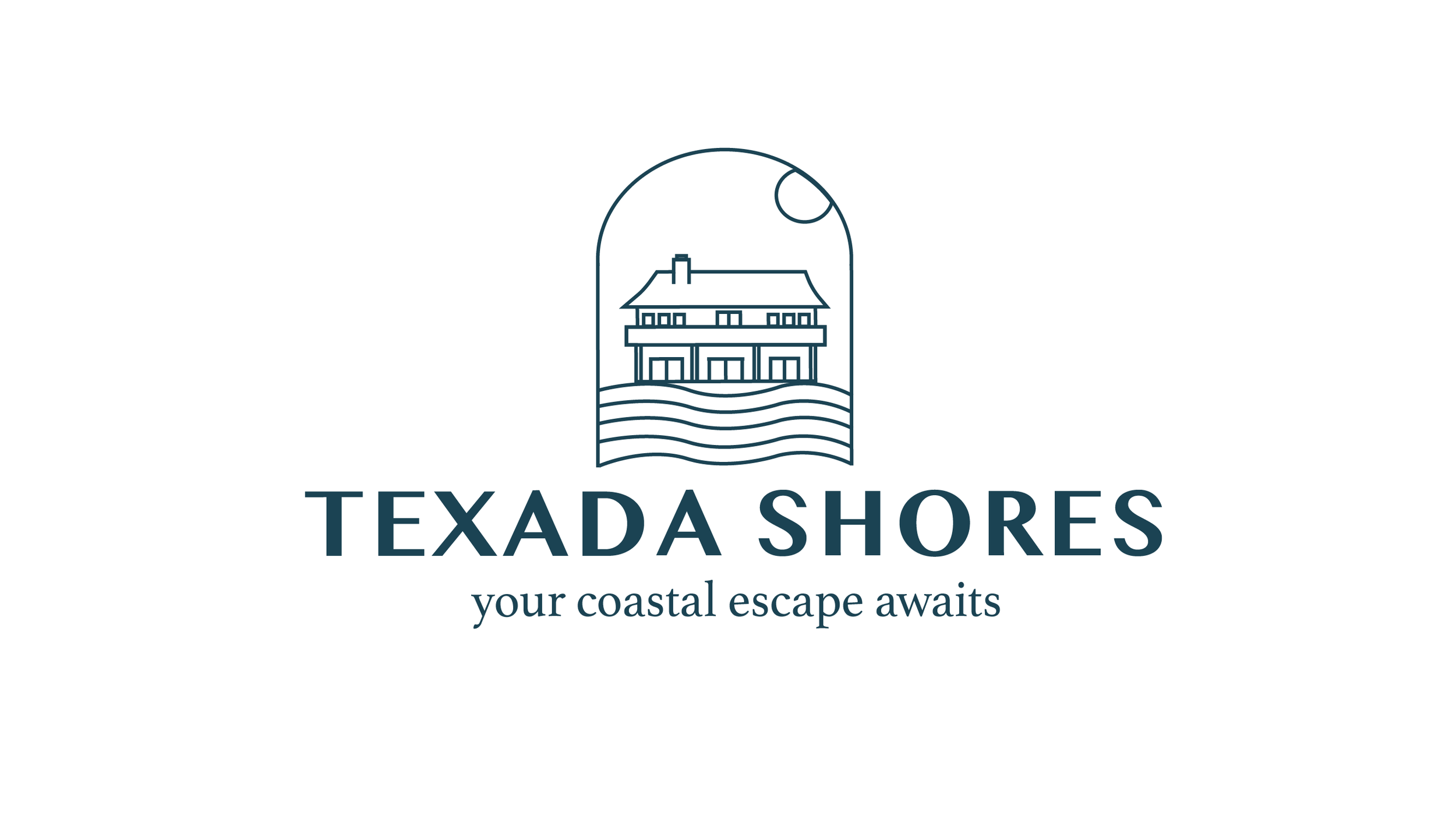
THIS BRANDS LOGO REPRESENTS THE LUXURIOUS ESTATE OF TEXADA SHORES FOLLOWED BY THE WAVES OF THE BREATHTAKING OCEAN-FRONT SITUATED ON THE VACATION RENTALS PROPERTY. INCORPORATING THE ESTATE AND SCENERY OF THE PROPERTY ALLOWS THE BRAND TO HAVE A MEMORABLE AND WELCOMING LOGO THAT IS PERSONAL, STANDS OUT AND IS TRUE TO THE BRAND.
this brands colour palette was inspired by the earthy and true colours that embody the essence of texada shores. colours such as mossy greens represent the dense forests, sandy beige to present the soft sand that stretches along texada island’s coast line, and ocean blues to mirror the clear skies overhead to the deep blue waters of the pacific ocean. the chosen colours offer versatility in design applications, allowing texada shores to remain consistent and recognizable across various applications.
COLOUR PALETTE


